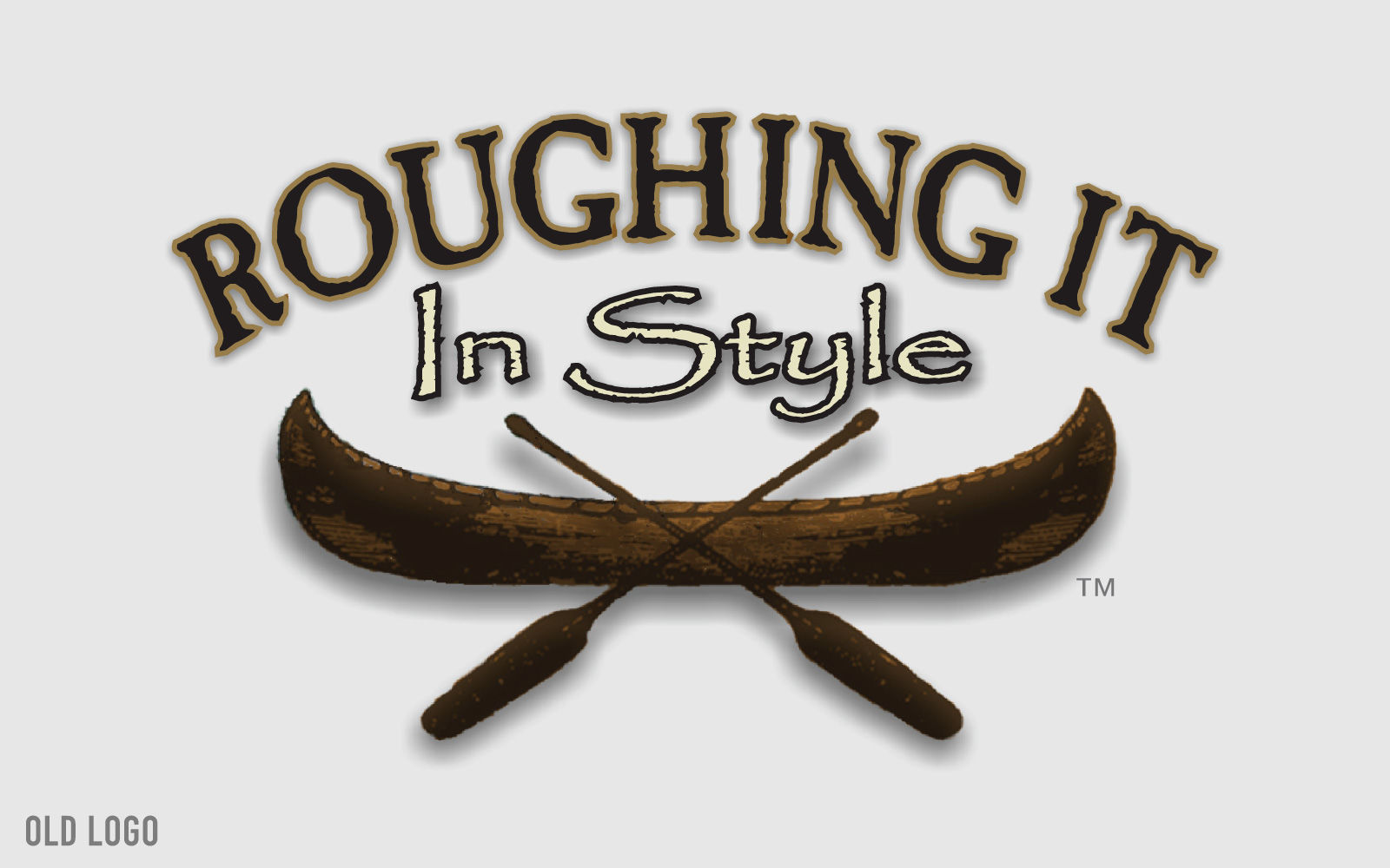
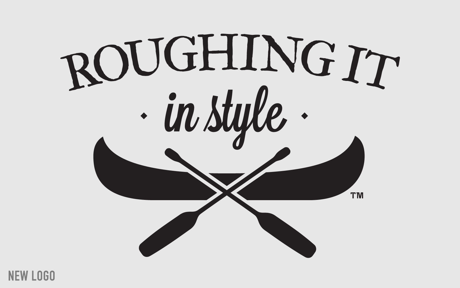
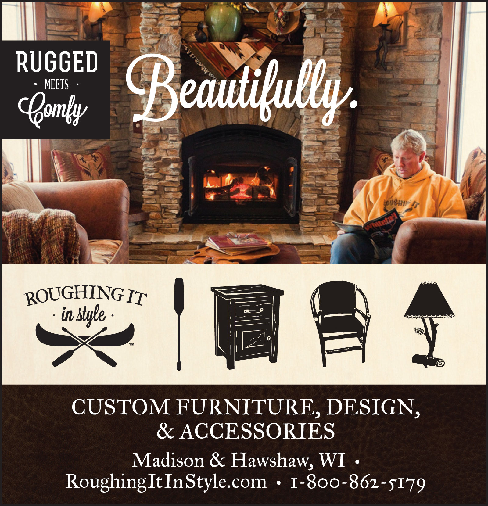
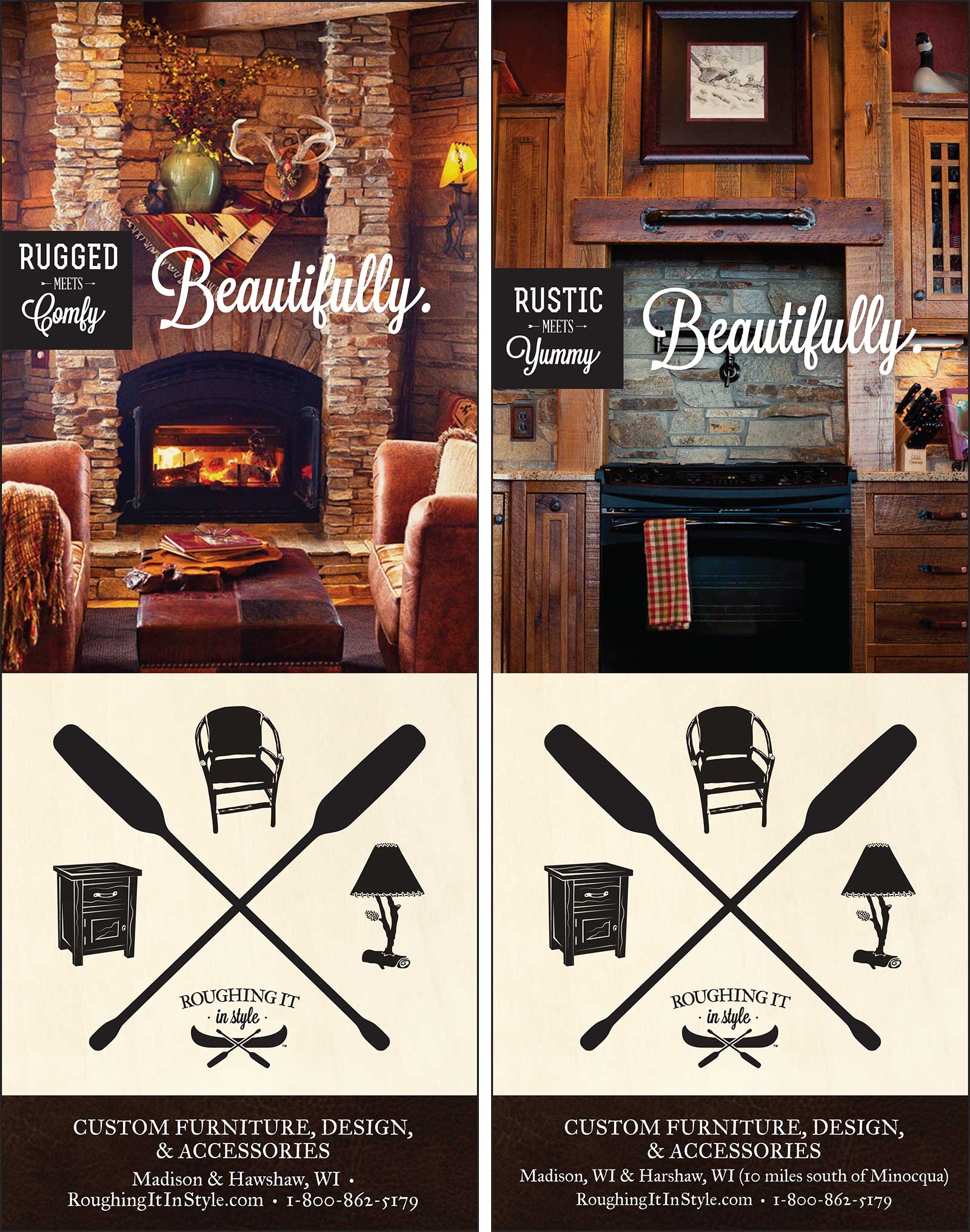
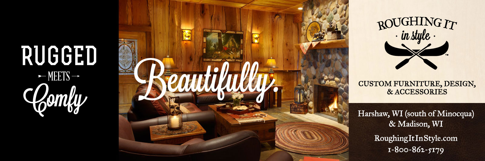
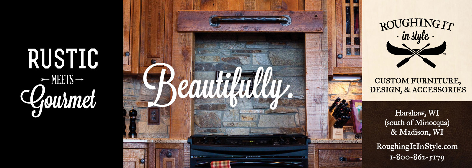
There were a couple of challenges to tackle when we took up Roughing It In Style as a client. Number one for me, was establishing a clean, properly-scaleable version of their logo with updated typography and some graphic punch to match the heavy, bold aesthetic of their products. With that, D.P.(Creative Director and Writer) created a theme in "Rugged meets Comfy" that allowed all these elements to sing together, beautifully. The rich textures implied by the previous version of their logo—now woven into their marketing via rich photography, compliment the bold, clean, graphic aesthetic driven by the updated logo and typography.